BOOK COVERS
Typography project
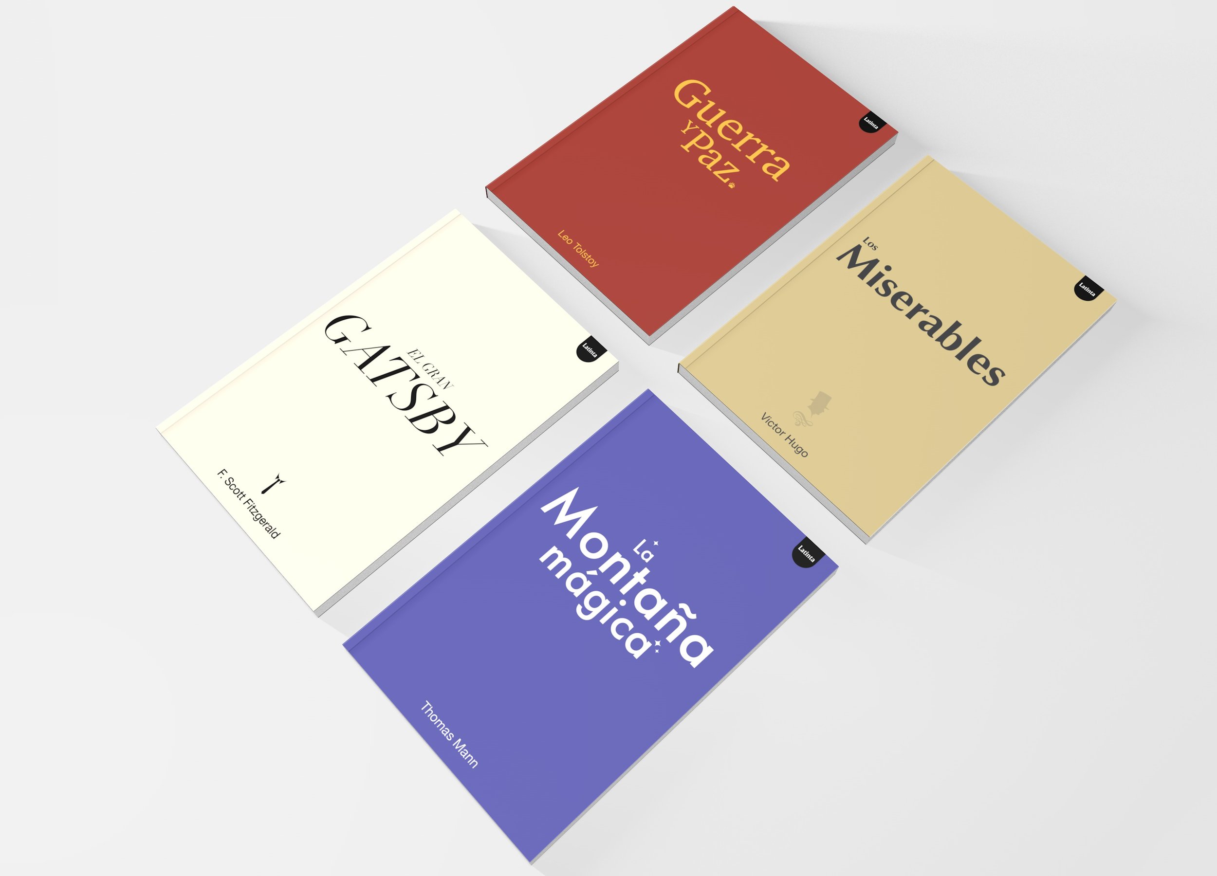
This project consisted of creating a collection of 4 book covers in which typography was the protagonist. For this project, the art direction focused on communicating the meaning of each of the works through color, typography and a distinctive element.
Graphic design
Typhography
Editorial Design
2023
-
Situation:
As a personal project, I set out to design a collection of classic book covers with a minimalist and typographic focus. My goal was to reinterpret literary masterpieces through a modern design lens, creating a cohesive visual system that celebrated the power of simplicity, symbolism, and typography.Task:
I aimed to develop a strong and unified visual identity centered around a publisher concept I created called “Latinta,” a blend of the words Latino and tinta (ink). Each cover needed to visually capture the essence of its novel while maintaining a consistent design language across the collection through typography, color, and symbolism.Action:
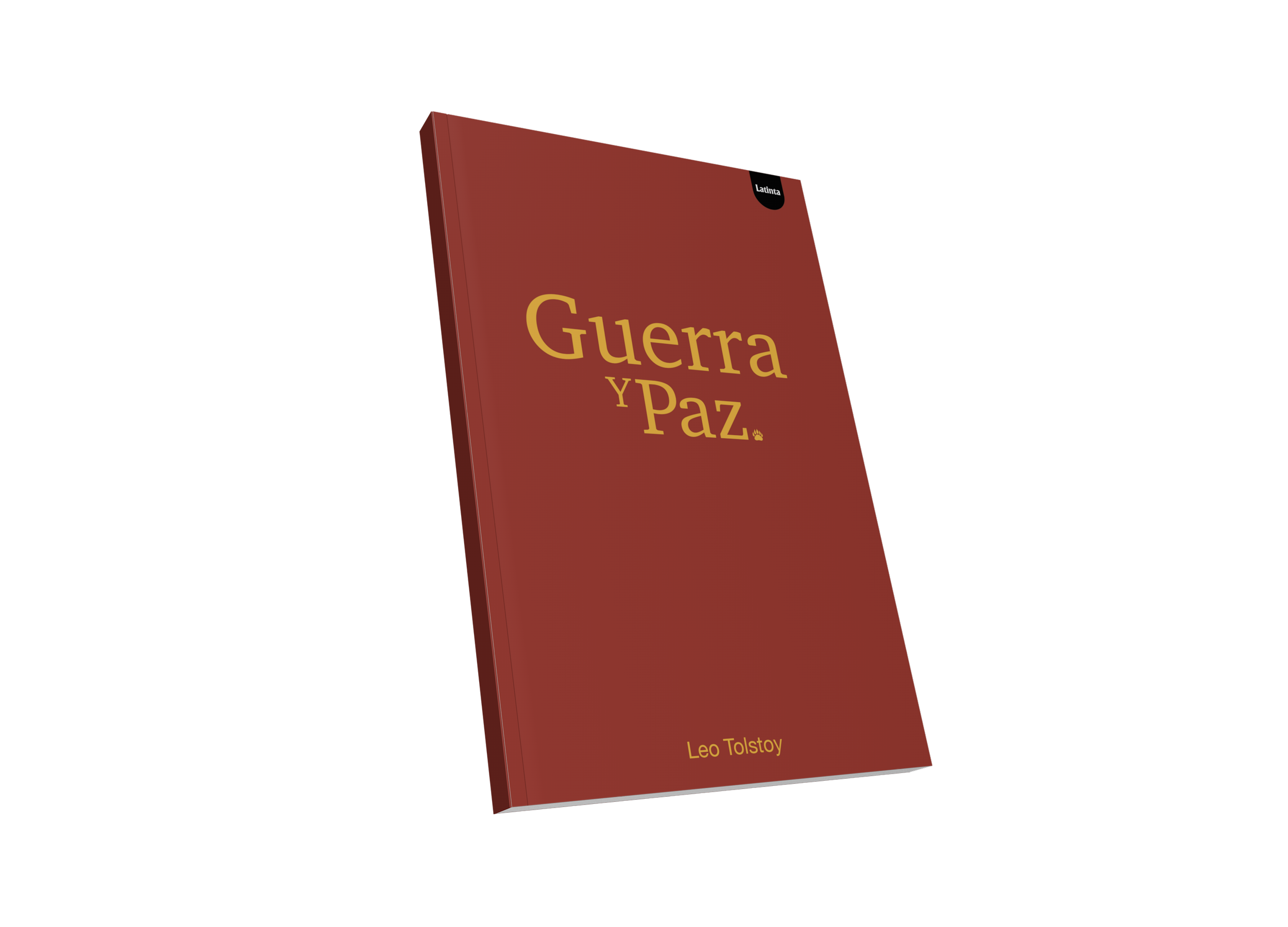
I chose a minimalist and clean approach where typography played the leading role. Color became a narrative element. The colors were red for war, beige for the people, black and white for luxury, and purple for magic.War and Peace (Leo Tolstoy): Used an old style serif typeface to evoke history and tradition, paired with a bear claw to symbolize Russia.
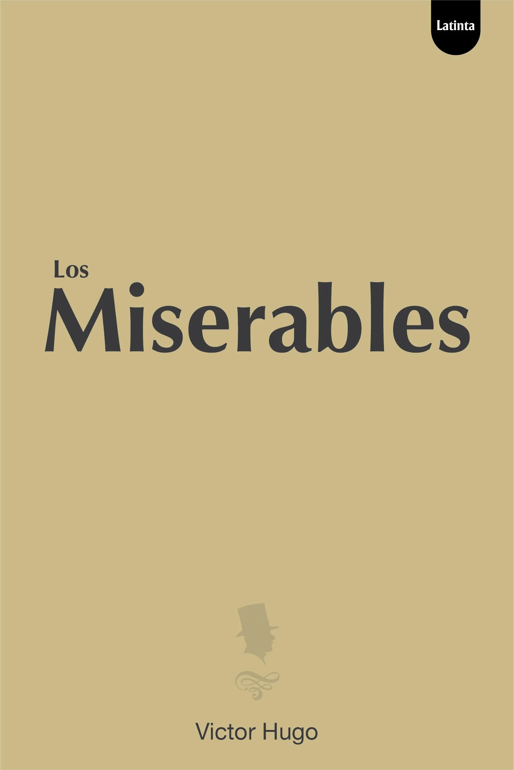
Les Misérables (Victor Hugo): Selected a humanist sans serif to reflect the people and the industrial revolution, with a translucent silhouette of a man in a hat representing Madeleine.
The Great Gatsby (F. Scott Fitzgerald): Chose an italic Didot to express elegance and luxury, complemented by a collar and tie symbol representing Gatsby.
The Magic Mountain (Thomas Mann): Used Paul Renner’s Futura for its modernist tone, slightly slanted to create a sense of floating in time, enhanced by four pointed stars to evoke magic.
Result:
The project resulted in a visually cohesive collection that balances typographic elegance and conceptual clarity. Each design captured the atmosphere of its novel while contributing to a unified visual identity under the Latinta concept, showcasing how minimalism and symbolism can reinterpret literary classics through modern design. -
Expertise:
Typhography Selection, Graphic Design, 3D modeling,
Tools:
Adobe Photoshop, Illustrator, Cinema 4D.
Keywords:
Books - Typography - Book Covers - Editorial Design


