KOKAE SPORT
Brand Identity & Product Line Design
400%
Product Portfolio Expansion
From 2 to 10 SKUs
2018 - 2023
Packaging
Supplements
Fitness & Wellness
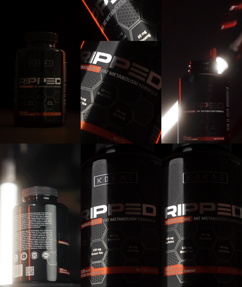
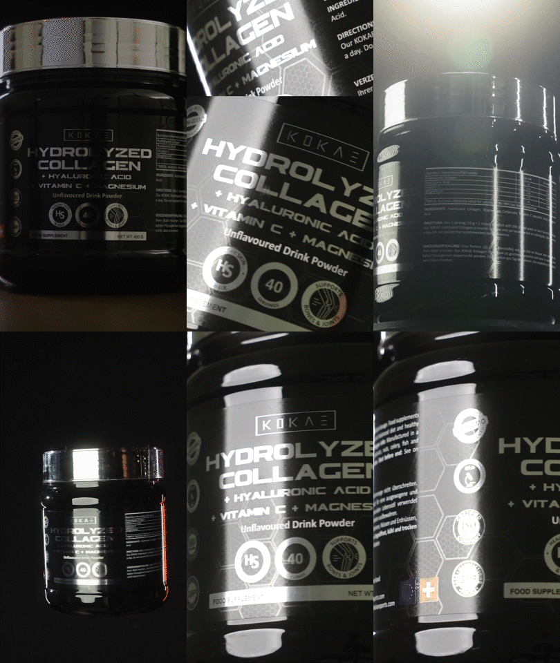
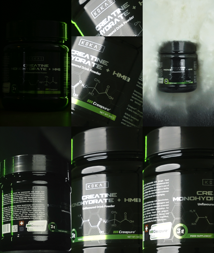
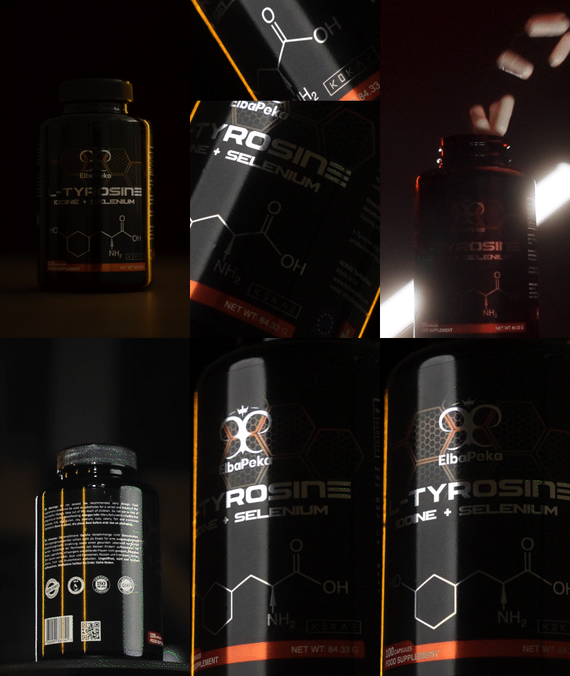
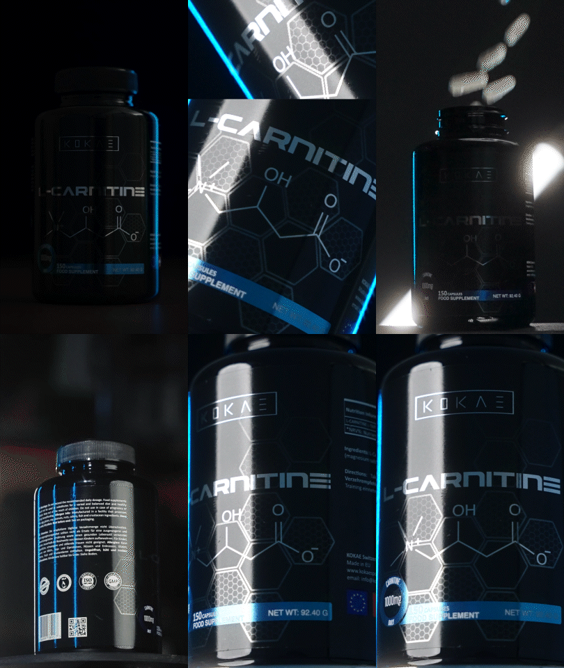
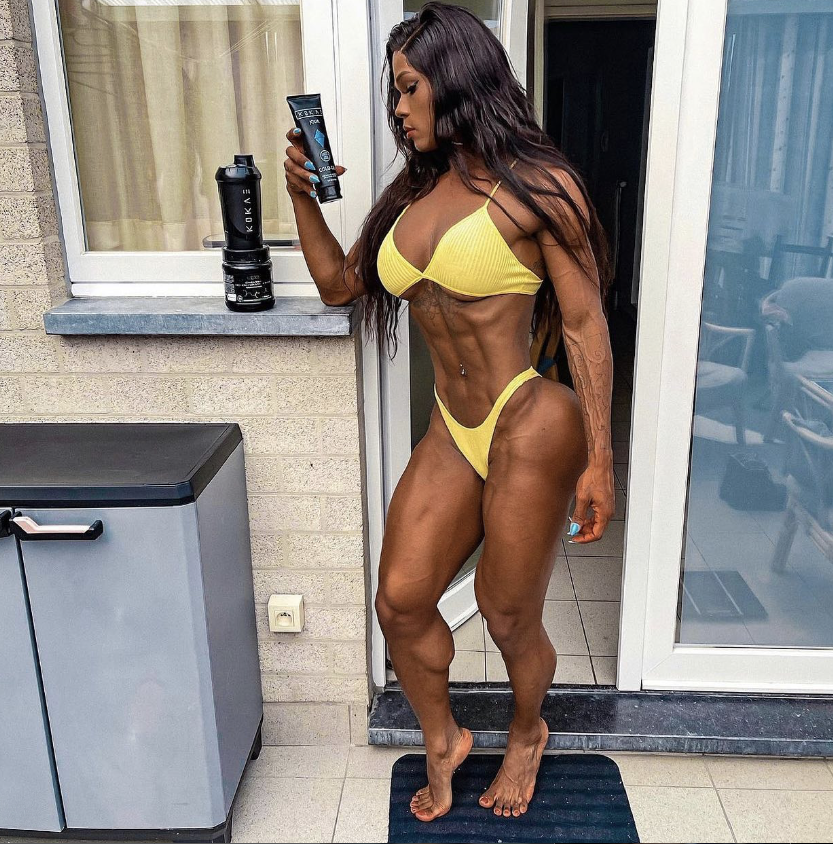
KOKAE is a Swiss brand dedicated to develop and provide high quality workout supplements, skincare and beauty products. Their products are made with trademark natural-based ingredients and their focus is to help the users to improve their lives through a healthy lifestile.
-
400% Product Portfolio Expansion
Scaled brand from 2 to 10 SKUs, achieving a +400% portfolio growth and stronger market presence.
Highlights:
Drove diversification across multiple product categories
Expanded customer reach and market adaptability
Boosted cross selling and average order value
Strengthened brand perception and revenue potential
-
Situation:
The Kokae team, an emerging Swiss brand in the wellness and fitness sector, initially contacted me to redesign the labels of their Hot Gel and Cold Gel products. The brand was facing a visual differentiation issue since both products used gray symbols with low contrast, making them difficult to distinguish on store shelves. This first assignment opened the door to a broader collaboration with Kokae, involving the complete redesign of their supplement line, packaging, advertising materials, and digital presence.Task:
I was responsible for developing a strong, modern, and cohesive visual identity for the entire brand, taking part in every design stage including labels, packaging, advertising materials, 3D product modeling, digital design, and the conceptualization of Kokae’s stand for Expo Fitness Basel 2018. All project phases were managed remotely. The main goal was to position Kokae as a premium wellness brand with a recognizable and appealing identity for both DTC and e-commerce markets.Action:
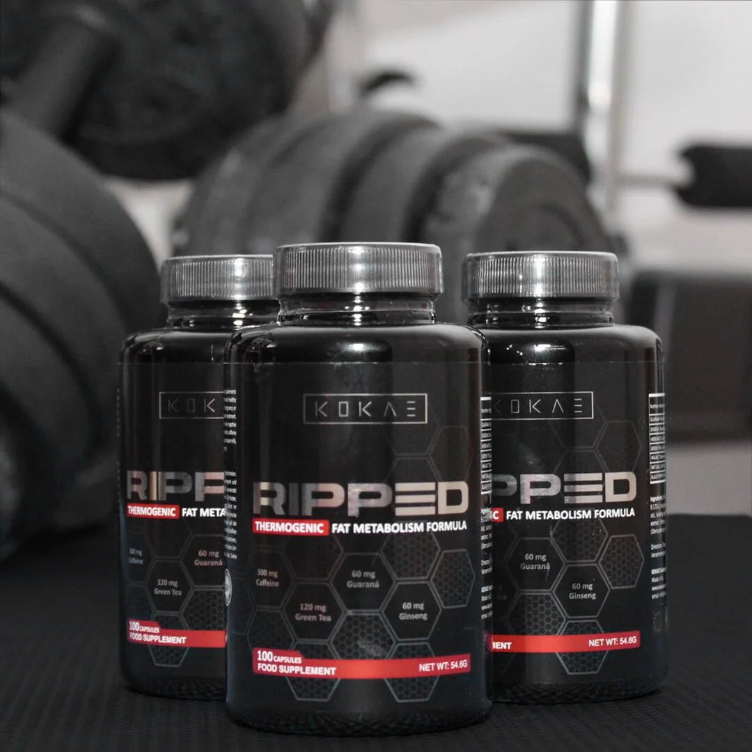
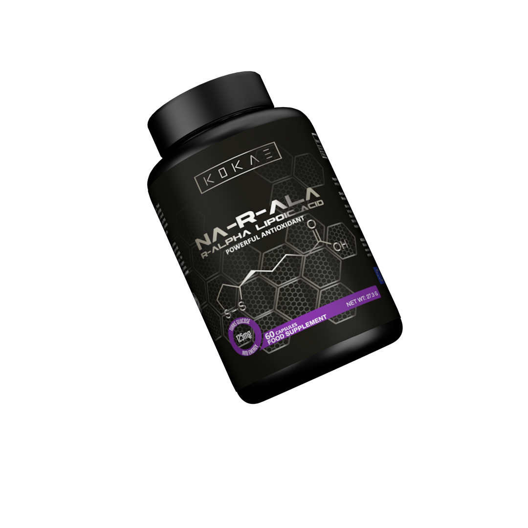
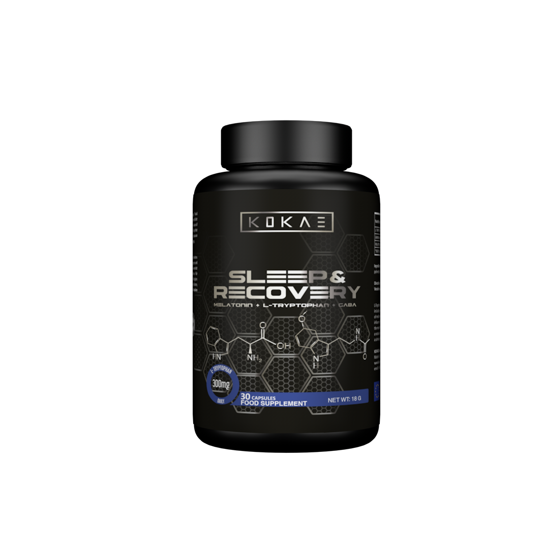
To solve the initial problem with the gels, I redesigned the symbols by creating a blue iceberg for the Cold Gel and an orange flame for the Hot Gel, achieving immediate differentiation aligned with each product’s function. Following this success, I developed the entire supplement line using the hexagon as the core design element, inspired by the natural composition of human cells and chemical bonds. I designed a robust, modern, and minimalist visual identity by selecting a solid typeface and a dynamic color palette centered around Kokae Black, the brand’s primary tone. I implemented 3D modeling, packaging tests, mockups, and iterative refinements until defining the final product. Additionally, I designed advertising materials, digital assets, merchandising, POP materials, stationery, displays, and ATL and BTL campaign visuals, ensuring consistent brand communication across all touchpoints.Result:
The redesign of Hot Gel and Cold Gel boosted sales and strengthened the client’s trust, leading to the design of Kokae’s complete supplement line. The project resulted in a unified and recognizable visual identity, with products that reflect a premium and modern aesthetic. The brand successfully expanded within DTC and e-commerce markets and launched a sub-brand called Kokae Woman, focused on women’s wellness and supplementation. This project became a milestone in my career, as I led the full development of a Swiss brand from concept to market implementation at an international level. -
Expertise:
Brand Identity, Packaging design, 3D Modeling & Rendering, Digital Marketing, Art Direction, , Design for E-commerce, Motion Design, Web design.
Tools:
Adobe Photoshop, Illustrator, After Effects, Premier Pro & Cinema 4D.Keywords:
- Health - Fitness - Lifestyle - Gym - Training - Workout - Supplements







This project was made possible thanks to Kokae Sports.


