
PALUMBO GOODS
Brand Identity & Packaging
1,650%
Product Portfolio Expansion
From 2 to 35 SKUs
Palumbo Goods Solutions Is a Swiss Start-Up founded in 2019. They offer consumers innovative and unique products based on eggs. Palumbo is focused on improve the customer lifestyle offering a product with unbeatable nutritional values, without forgetting the well-being of the animal.
Graphic design
Branding
PCG, F&B
2020
-
Product Expansion & Revenue Growth
Expanded Palumbo Goods Solutions from 2 to 35 SKUs (+1650%) across 8 new product lines while driving +20% sales growth through designs for targeted Meta advertising and e-commerce lead optimization.
Highlights:
Scaled product portfolio massively, increasing market offering and category coverage
Launched 8 new product lines enhancing brand diversity and customer choice
Boosted DTC sales by 20% with top tire ad designs for paid media campaigns
Optimized e-commerce funnels to convert social leads into buyers
Strengthened brand positioning as an innovative, nutritional lifestyle brand
Secured placement in European retail chain ALDI, expanding brand distribution and market visibility
Product Lines:
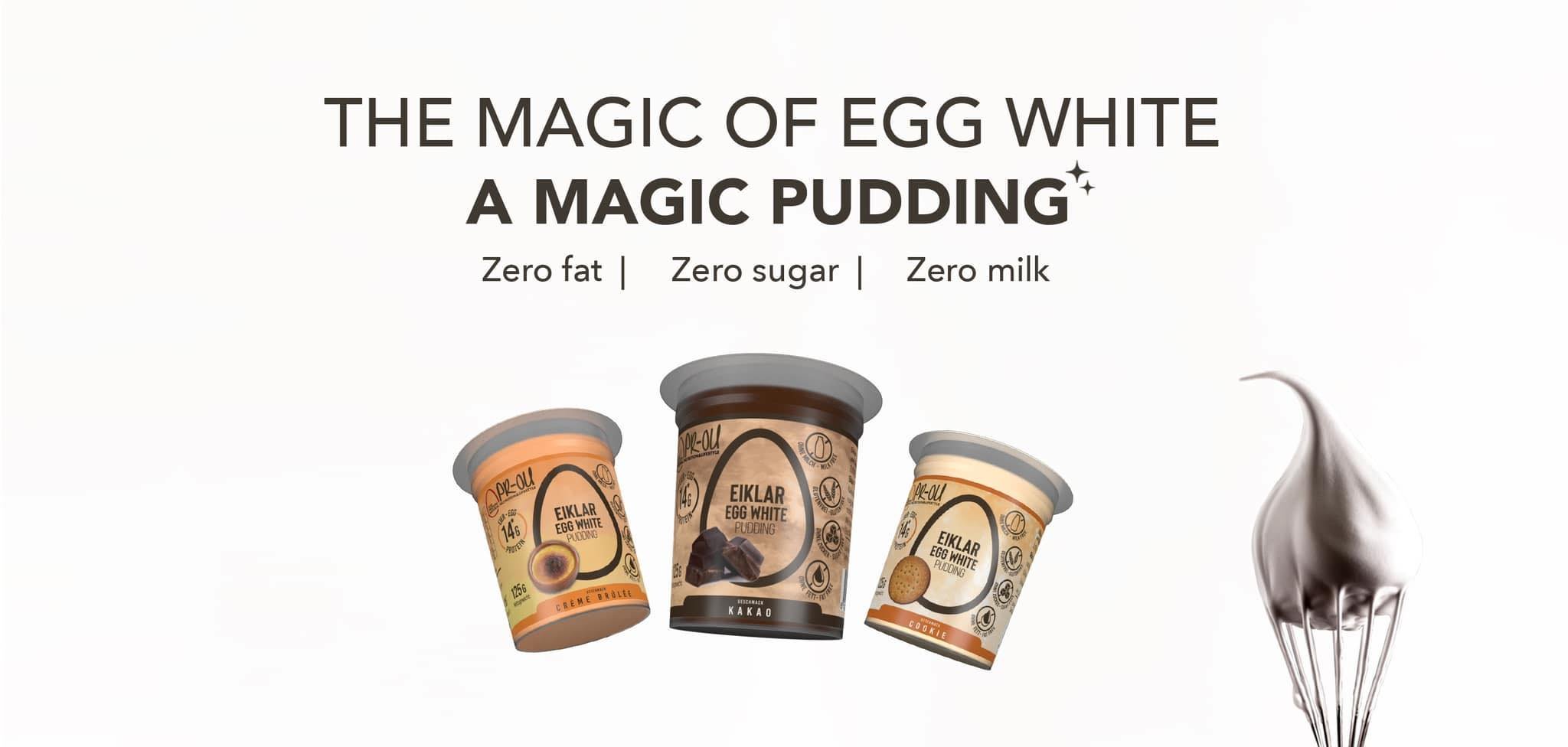
1 - Eiklar Egg Whites, 2 - Eiklar Puddings, 3- Eiklar Egg White Drinks, 4- New Eiklar Egg Whites 2023,
5- Crunchy Protein Muesli, 6-Eiklar Egg White Cream Cakes, 7- Eiklar Oats Cream Cakes, 8-Eiklar Puddings 25’ -
Situation
Palumbo Goods Solutions, a food product startup specializing in egg based items, approached me at the time of their launch to design a cohesive brand identity and establish their E-commerce platform. The client sought a brand that communicated energy, simplicity, and an organic feel while supporting their business focus on transportation, sale, and distribution of food products.Task
My responsibility was to create a complete brand identity from the ground up, including logo design, color and typography selection, and packaging concepts. The goal was to craft a visual identity that reflected the brand’s values, resonated with their lifestyle and fitness oriented target audience, and could be applied across multiple product lines and digital touchpoints.Action
I began with photo touch ups for one of their egg white products, which expanded into designing the full brand identity. For the brand concept, I explored themes of “The good delivery,” emphasizing dynamism and movement through abstract, human centered imagery. The final logo integrated the letters PGS into a human figure receiving a good. I developed a color palette with yellow, blue, gray, and orange to balance energy, trust, and corporate stability, while selecting two complementary sans serif typefaces, one modern and uppercase for headers and corporate use, and one organic style for advertising. I applied these design elements consistently across seven product lines, creating over 35 packaging, labeling, and 3D modeling projects for the client.Result
The outcome was a fully developed, professional brand identity that visually communicated the organic, energetic, and trustworthy nature of Palumbo Goods Solutions. My work was successfully applied across all product lines and digital platforms, establishing a cohesive and modern brand presence that appealed to their target audience in the lifestyle and fitness markets. With the new product presentation and branding, the client improved their E commerce sales by 25%. -
Expertise:
branding, corporate Identity, packaging design, graphic design, creative direction, stationery design, 3D modeling, visual desing & design for advertising and social media
Tools:
Adobe Photoshop, Illustrator, InDesign, Cinema 4D.
Keywords:
Egg - Protein - Fitness - Health - Consumer goods - e-commerce -Shopify - Egg Products


User interaction photos are courtesy of Palumbo Goods Solutions.
